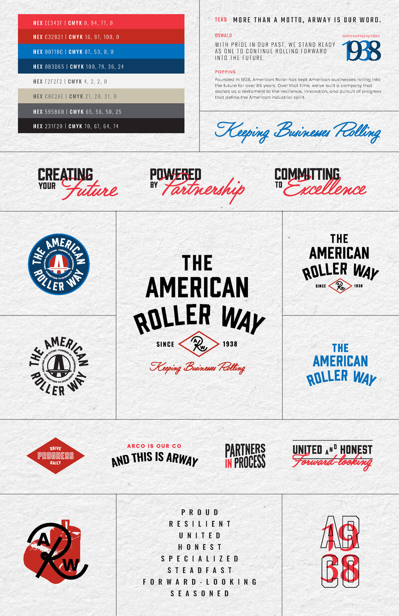
ARWay brand snapshot: identity system, color palette, and character words
// Internal Brand / Manufacturing
American Roller Company needed more than a logo refresh. They needed an internal brand that could rally 200+ employees around a shared identity, arm an at-times old-school sales force with a new vocabulary, and build buy-in from the shop floor to the C-suite before anything went external.
The Challenge
American Roller has been keeping American businesses rolling since 1938. But after 85+ years, the company's identity was more institutional memory than articulated brand. Different divisions described the company differently. The sales team, many of whom had been with the company for decades, relied on relationships and technical expertise rather than any unified brand story.
The strategy with the client was clear: launch a full brand refresh internally first. Get buy-in from employees. Give the sales force a new way to articulate what sets American Roller apart. Only then take it external. The internal launch had to feel like a real event, not a memo from corporate.
My Role
I developed the brand positioning, naming convention, voice guidelines, and all launch campaign copy. "The American Roller Way" became "ARWay" for short, a name that gave employees something to rally around. I wrote the brand snapshot, character words, tagline, pillar phrases, and then built the entire internal launch campaign: a multi-touch email sequence, a 36" illustrated poster, and the video script.
Brand Foundation
The brand voice centers on eight character words: Proud, Resilient, United, Honest, Specialized, Steadfast, Forward-Looking, and Seasoned. Three pillar phrases carry the positioning: "Creating Your Future," "Powered by Partnership," and "Committing to Excellence." The tagline, "Keeping Businesses Rolling," ties it all back to the company's core promise.
The Work
The brand snapshot became the single reference document for every touchpoint that followed. It codifies the logo system (multiple lockups built from the heritage badge), a color palette rooted in the company's red and blue, typography, tagline variations, pillar phrases, and the character words that define how ARWay sounds when it speaks.
The identity had to feel earned, not invented. Everything traces back to what already made American Roller distinct: the pride on the manufacturing floor, the depth of technical partnerships, and the commitment to operational excellence that kept the company running for nearly a century.
ARWay brand snapshot: identity system, color palette, and character words
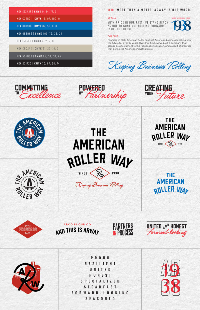
Typography, tagline variations, and brand positioning
Internal Launch
The internal launch needed to create genuine momentum. A brand refresh only works if people actually engage with it, so I designed a multi-touch rollout that built anticipation before the big reveal. The campaign included a sequenced email series that introduced ARWay across every department, a 36-inch illustrated poster that mapped out the brand's pillars and values as an isometric "house" employees could explore, and a launch video that brought the whole thing to life.
Each email in the sequence served a different purpose in the rollout: teasing the rebrand, introducing the ARWay identity, embedding the video, driving attendance to mandatory kickoff events, and connecting employees to their division's new Teams channels.
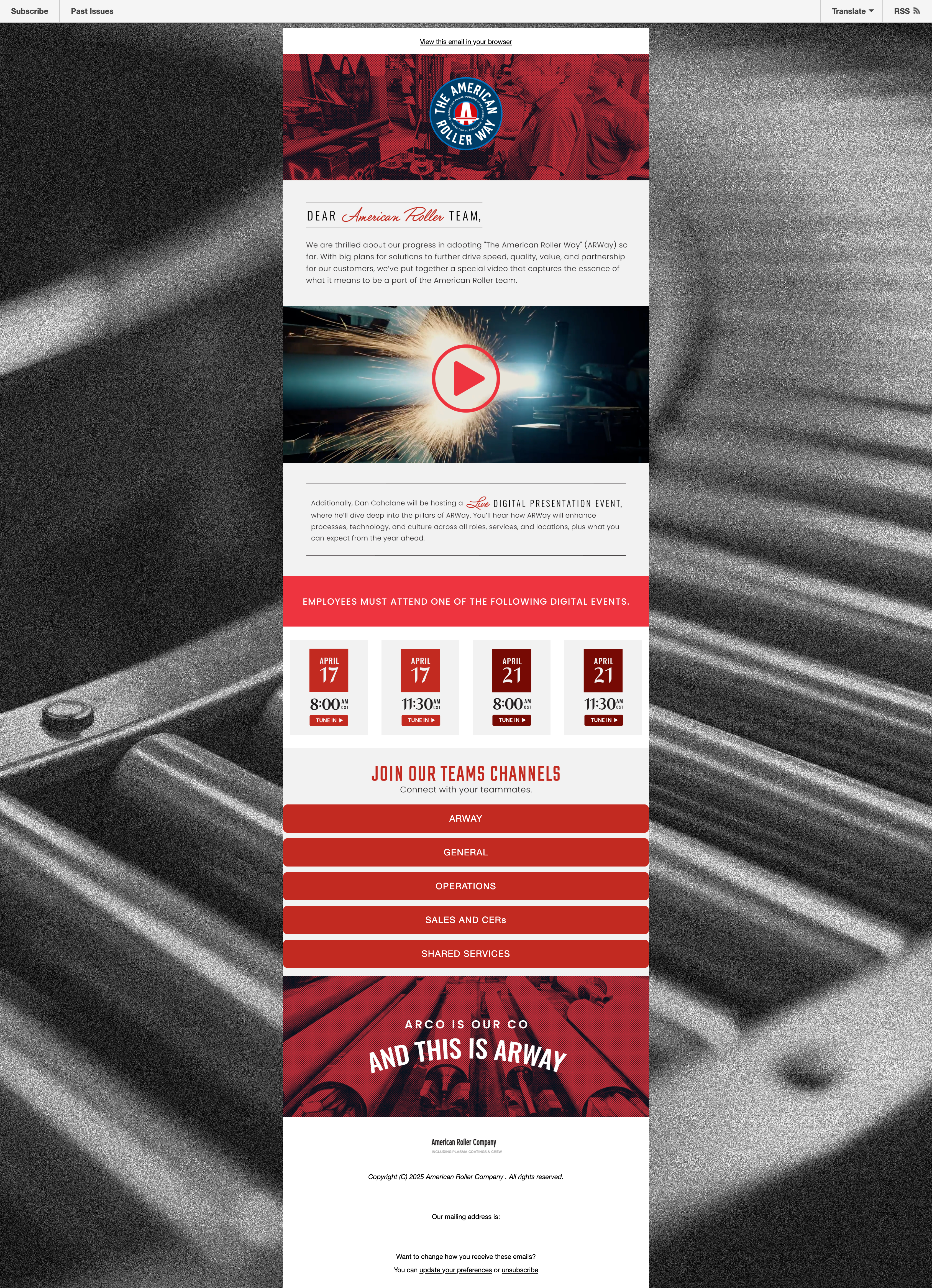
The primary launch email introduced the ARWay brand with an embedded video player, mandatory kickoff event dates across two weeks, and direct links to each division's new Teams channel. The design mirrors the brand's red-and-blue palette with the industrial photography that runs through the entire identity.
The email had to do real work: not just announce a rebrand, but drive attendance to live events and get 200+ employees connected to new communication channels on a specific timeline.
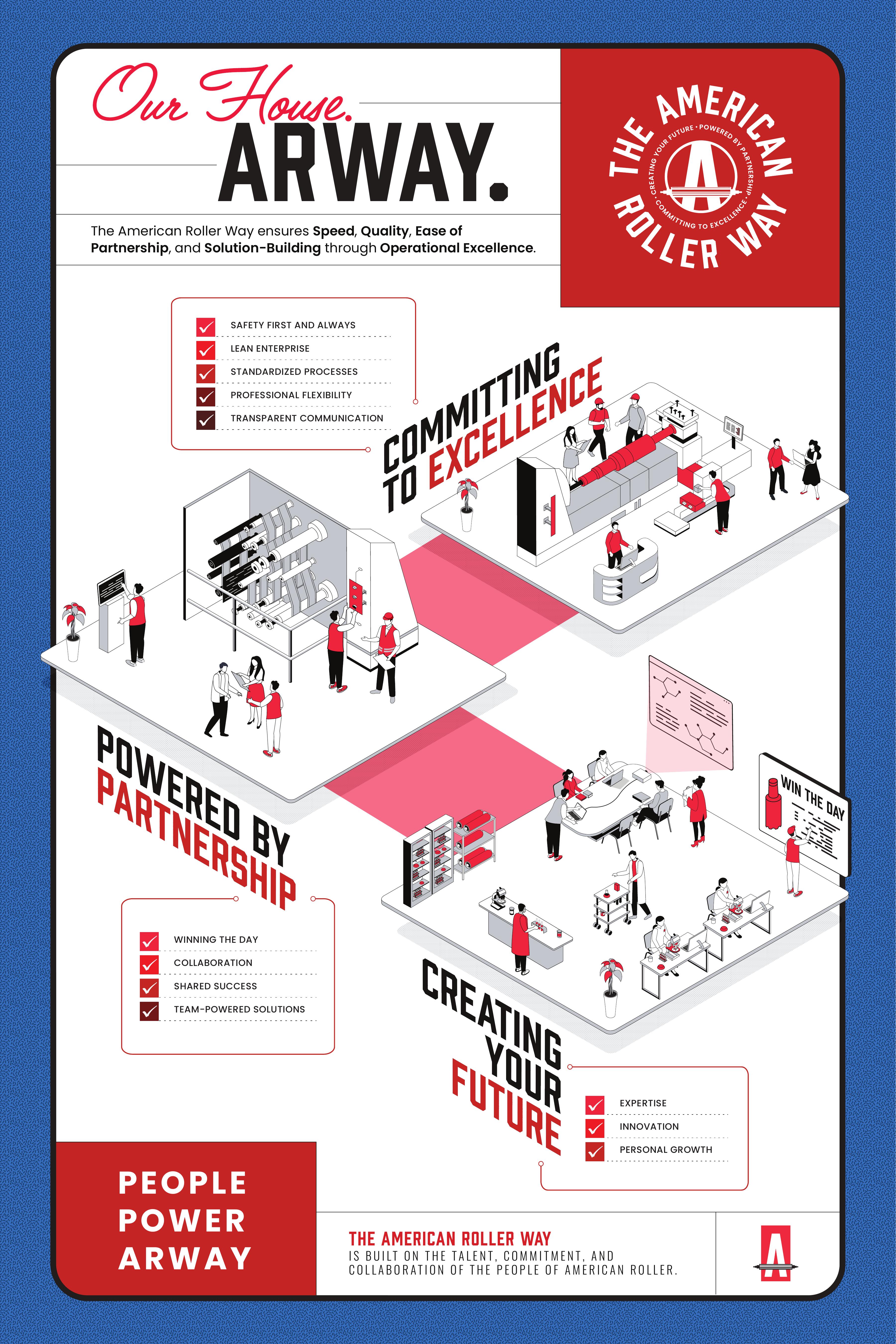
"Our House. ARWay." 36" illustrated poster mapping the brand's pillars, values, and character words
Impact
ARWay gave American Roller something they'd never had: a unified internal language for what makes the company different. The launch campaign reached every employee, the brand snapshot became the go-to reference for sales conversations, and the identity system is now the foundation for external marketing as the brand rolls out publicly.
Logo system, color palette, character words, and voice guidelines adopted company-wide
Multi-touch email sequence reaching 200+ employees across all divisions
Isometric brand map displayed across office and manufacturing locations
Scripted and produced brand film anchoring the internal kickoff